Curatorial Narrative
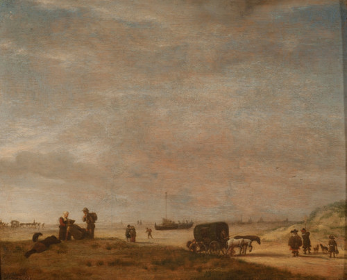
The Beach with Ships near Scheveningen, crafted by Abraham de Verwer in the early to mid-17th century, occupies a pivotal position within the Dutch Golden Age's landscape tradition. Characterized by fine brushwork and an unassuming palette of pale blues, grays, and soft browns, this work embodies the minimalist sensibilities that defined 17th-century Dutch art.
Its understated coloration eschews vivid contrasts in favor of an atmospheric subtlety that invites contemplation rather than spectacle. By situating the viewer's gaze along a horizontal axis, de Verwer creates a spatial rhythm that echoes the rolling waves and meandering shoreline depicted within the painting itself. This compositional structure imbues the work with an unassuming sense of depth and scale.
When enlarged to 81x44 inches, the Beach with Ships near Scheveningen becomes a nuanced object in its own right. The pale blues and grays that dominate the palette interact with a range of interior materials – from smooth limestone to richly textured wood – to create complex chromatic structures. Light plays a crucial role here as well, accentuating the atmospheric weight that de Verwer's subtlety has built over time.
The spatial impact of this work within a luxury interior environment is considerable. By introducing an element of restraint and proportion, Beach with Ships near Scheveningen invites consideration of material pairing and the strategic deployment of light sources. In this context, its understated coloration becomes an effective counterbalance to more dramatic or opulent elements, fostering a sense of equilibrium that is at once visually appealing and intellectually engaging.
In such a setting, the painting's minimalist design styles – coastal and nautical in inspiration – can be seen as a deliberate choice rather than simply a stylistic convention. This decision underscores de Verwer's interest in capturing the atmospheric qualities of the shoreline experience, which in turn encourages an appreciation for the intricate interplay between light, material, and spatial structure that defines this work.
De Verwer's use of a landscape subject also raises questions about the relationship between art and architecture within the interior environment. In situating Beach with Ships near Scheveningen as a designed object rather than simply a print or reproduction, one can begin to consider how its formal characteristics might be leveraged to enhance the overall spatial cohesion of a given space.
Ultimately, this painting's understated yet precise qualities – from its fine brushwork to its judicious use of color and composition – make it an exemplary choice for those seeking to introduce a nuanced sense of spatial rhythm and chromatic structure into their luxury interior designs.
Its restrained visual language supports minimalist environments without competing for attention.
Architectural Behavior
Its horizontal span reinforces axial movement across long architectural planes.
This edition functions as a 81x44 interior anchor, shaping spatial rhythm and establishing a stable visual cadence within the surrounding architecture.
Its chromatic structure responds to natural and artificial lighting, modulating depth and atmospheric weight throughout the day.
Recommended material pairings include natural oak, brushed metal, matte stone composites, and textured linen surfaces.
Gallery Edition Specifications
- Format: 81" x 44" Interior Architectural Study
- Medium: 330gsm Ultra-Premium Fine Art Matte
- Ink System: Wide-gamut archival pigment curation
- Mounting: Delivered unframed for professional gallery installation
Each edition is prepared to order. Gallery-standard quality control requires 3 to 5 business days.