Curatorial Narrative
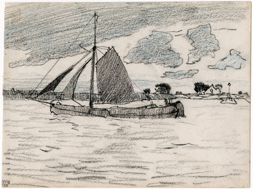
Adolf le Comte's "Op de oever getrokken schuit" exists at the cusp of late 19th-century Impressionism, its creation date obscured by time. The artist's brushwork is characterized by a softness that dissolves spatial boundaries, conjuring an ephemeral marine scene. Neutral tones dominate the palette, with accents of orange bursting forth from the sail as a fleeting splash of color. This deliberate restraint allows the viewer to settle into the painting's atmospheric weight, suspended between the tranquil atmosphere and the hint of turbulence.
As this artwork is enlarged to 64x44, its chromatic structure assumes a more pronounced role in the space it inhabits. The neutral tones recede, allowing the accents of orange to take center stage. In a luxury interior environment, this palette would pair well with rich materials such as polished wood and supple leather, their texture and sheen offset by the painting's smooth surface. Spatial depth is achieved through le Comte's subtle manipulation of atmospheric perspective, creating a visual rhythm that ebbs and flows across the canvas. This dynamic interplay between color, light, and spatial structure imbues the space with an airy sense of movement, underscoring the importance of carefully calibrated lighting to avoid overwhelming the painting's gentle luminescence.
In this architectural context, le Comte's "Op de oever getrokken schuit" assumes a new role as designed object. The compositional structure, initially conceived for intimate contemplation, now engages with the larger spatial rhythms of the interior. As such, it becomes an integral component of the environment, its atmospheric weight influencing the surrounding space in subtle yet significant ways.
This edition adapts fluidly across contemporary interior profiles, offering a stable architectural anchor.
Architectural Behavior
Its horizontal span reinforces axial movement across long architectural planes.
This edition functions as a 64x44 interior anchor, shaping spatial rhythm and establishing a stable visual cadence within the surrounding architecture.
Its chromatic structure responds to natural and artificial lighting, modulating depth and atmospheric weight throughout the day.
Recommended material pairings include natural oak, brushed metal, matte stone composites, and textured linen surfaces.
Gallery Edition Specifications
- Format: 64" x 44" Interior Architectural Study
- Medium: 330gsm Ultra-Premium Fine Art Matte
- Ink System: Wide-gamut archival pigment curation
- Mounting: Delivered unframed for professional gallery installation
Each edition is prepared to order. Gallery-standard quality control requires 3 to 5 business days.