Curatorial Narrative
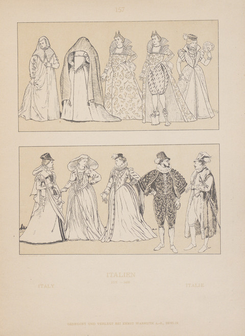
Adolf Rosenberg's "Italy" (1905) situates itself within the tumultuous cultural landscape of early 20th-century Europe. Executed in a fine brushwork that betrays a deep understanding of Baroque techniques, the painting's visual syntax is marked by a deliberate employment of chiaroscuro to conjure an atmosphere of reverie. The interplay between light and dark serves as a counterpoint to the figurative subject, imbuing it with a sense of psychological depth and historical resonance.
The palette, characterized by an austere balance of gold, red, blue, white, and brown, operates within a complex chromatic structure that recalls the Renaissance Revival's emphasis on classical ideals. As such, "Italy" occupies a unique position at the confluence of two major artistic movements: the expressive vitality of Expressionism and the rigorous formalism of early modernism. When enlarged to 60x44 inches, the painting's atmospheric weight and spatial rhythm become even more pronounced, with the golds and reds taking on an almost material quality.
In a luxury interior environment, "Italy" would assert its dominance through a carefully calibrated interplay between light and space. The painting's fine brushwork would be ideally paired with rich textiles that capture the play of chiaroscuro, while the muted tones would serve as a backdrop for polished metallic surfaces that reflect the golds and reds in an almost three-dimensional manner. As the eye moves through the composition, it would encounter a series of spatially defined zones, each imbued with its own distinct atmospheric weight and chromatic character. The resulting effect would be one of visual equilibrium, as if the painting had been designed to occupy this very space from the outset.
The overall impact of "Italy" on an interior environment would be that of a carefully calibrated system of contrasts: light and dark, warm and cool, material and atmospheric. Each element in the room – from the sculptural forms of the furniture to the subtle play of natural light – would be drawn into a dialogue with the painting's complex visual syntax, generating a spatial rhythm that is at once nuanced and expansive. In this context, "Italy" would emerge as a masterful deployment of artistic vision, one that redefines our understanding of the relationship between art, space, and the human experience.
This edition adapts fluidly across contemporary interior profiles, offering a stable architectural anchor.
Architectural Behavior
Its horizontal span reinforces axial movement across long architectural planes.
This edition functions as a 60x44 interior anchor, shaping spatial rhythm and establishing a stable visual cadence within the surrounding architecture.
Its chromatic structure responds to natural and artificial lighting, modulating depth and atmospheric weight throughout the day.
Recommended material pairings include natural oak, brushed metal, matte stone composites, and textured linen surfaces.
Gallery Edition Specifications
- Format: 60" x 44" Interior Architectural Study
- Medium: 330gsm Ultra-Premium Fine Art Matte
- Ink System: Wide-gamut archival pigment curation
- Mounting: Delivered unframed for professional gallery installation
Each edition is prepared to order. Gallery-standard quality control requires 3 to 5 business days.