Curatorial Narrative
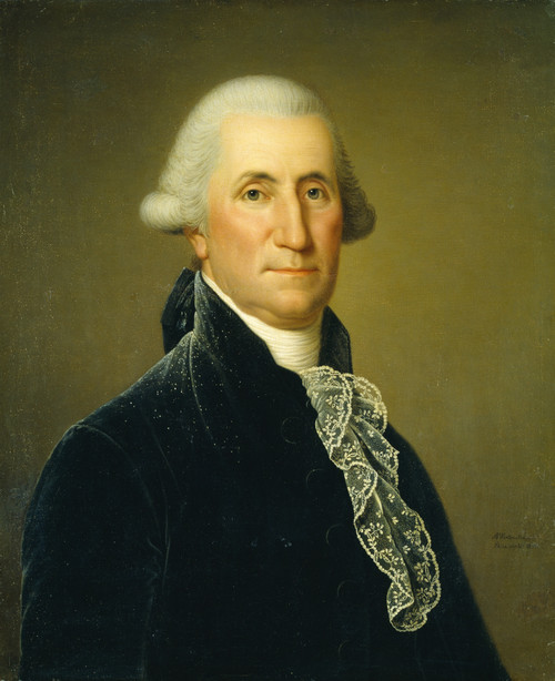
The portrait of Madame Barton, née Margaret Black, by Adolf Ulrik Wertmüller embodies the Neoclassical ideals of restraint and balance. Executed in the late 18th century, the painting's formal structure is a testament to the artist's mastery of the genre. Wertmüller's brushwork is characterized by fine lines and delicate strokes that imbue the subject with an air of quiet dignity.
The artist's palette is notable for its judicious use of light blue, beige, and brown hues, which collectively create a sense of atmospheric weight that is both somber and introspective. The Neoclassical design style is evident in the painting's symmetrical composition, which creates a sense of spatial rhythm through the careful placement of the subject within the frame. At an enlarged scale of 44x52, the portrait's chromatic structure begins to dominate the surrounding space, with the light blue tones seeming to recede into the background while the warmer hues advance towards the viewer.
When enlarged, the painting's atmospheric weight shifts and becomes more pronounced, casting a subtle shadow on the surrounding surfaces. This shift in spatial dynamics creates an interesting dialogue between the portrait and its environment, one that is both engaging and thought-provoking. The chromatic structure of the painting, with its warm beige tones and cool light blue undertones, begins to interact with the materiality of the space itself, creating a nuanced relationship between texture and color.
The Regency design style that informs the composition's geometric structure and balanced proportions becomes even more apparent at this larger scale. The spatial rhythm established by Wertmüller is one of subtle tension and release, as the viewer's gaze is drawn towards the subject before being subtly deflected by the surrounding background. This carefully calibrated balance between figure and ground creates a sense of visual equilibrium that is both soothing and engaging.
In a luxury interior environment, this painting would be best paired with materials and finishes that reflect its Neoclassical heritage. A subtle combination of creamy whites, rich woods, and muted silks would provide an ideal backdrop for the portrait's delicate chromatic structure. The soft light required to bring out the painting's atmospheric weight would also serve to highlight the surrounding materials, creating a harmonious dialogue between the artwork and its environment.
At this larger scale, the spatial dynamics of the painting become even more pronounced, with the subject seeming to occupy a more central position within the frame. This increased sense of importance is reinforced by the Regency design style's emphasis on geometric structure and balanced proportions. The composition's carefully calibrated balance between figure and ground creates a sense of visual equilibrium that is both soothing and engaging.
The chromatic structure of the painting, with its warm beige tones and cool light blue undertones, continues to interact with the materiality of the space itself, creating a nuanced relationship between texture and color. This subtle interplay between the artwork and its environment would be best served by a thoughtful selection of materials and finishes that complement the painting's Neoclassical heritage.
In terms of lighting behavior, the portrait's atmospheric weight requires a soft, diffused light to bring out its delicate chromatic structure. This would also serve to highlight the surrounding materials, creating a harmonious dialogue between the artwork and its environment. The spatial impact of the painting is one of subtle tension and release, as the viewer's gaze is drawn towards the subject before being subtly deflected by the surrounding background.
The Regency design style that informs the composition's geometric structure and balanced proportions becomes even more apparent at this larger scale. The carefully calibrated balance between figure and ground creates a sense of visual equilibrium that is both soothing and engaging. This subtle interplay between the artwork and its environment would be
This edition adapts fluidly across contemporary interior profiles, offering a stable architectural anchor.
Architectural Behavior
Its vertical rise introduces a stabilizing architectural counterpoint.
This edition functions as a 44x52 interior anchor, shaping spatial rhythm and establishing a stable visual cadence within the surrounding architecture.
Its chromatic structure responds to natural and artificial lighting, modulating depth and atmospheric weight throughout the day.
Recommended material pairings include natural oak, brushed metal, matte stone composites, and textured linen surfaces.
Gallery Edition Specifications
- Format: 44" x 52" Interior Architectural Study
- Medium: 330gsm Ultra-Premium Fine Art Matte
- Ink System: Wide-gamut archival pigment curation
- Mounting: Delivered unframed for professional gallery installation
Each edition is prepared to order. Gallery-standard quality control requires 3 to 5 business days.