Curatorial Narrative
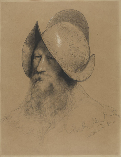
"Offiser" by Adolph Tidemand, created in 1875, occupies a pivotal position within the tradition of Norwegian realism. The artist's deft handling of chiaroscuro imbues the figures with an air of gravity and quiet introspection, while his palette of neutral tones – beige and gray – serves to underscore the somber mood. The brushwork is fine, yet deliberate, as if each stroke has been carefully considered to convey the psychological weight of the scene.
When enlarged to 44x57 inches, the chromatic structure of "Offiser" assumes a more pronounced role within the interior environment. The neutral tones appear to absorb and diffuse light, creating an atmosphere of subdued contemplation. The composition's spatial rhythm, governed by the placement of figures and negative space, begins to modulate the sense of depth and volume within the room. In a luxury interior setting, this artwork would pair well with materials that respect its somber tone – dark woods, matte finishes, or soft furnishings in muted hues – while strategic lighting can be employed to highlight the atmospheric weight of Tidemand's brushwork.
The scale of "Offiser" also allows for consideration of its relationship with architectural features. In a large room, the composition's vertical axis might be echoed by the lines of a tall cabinet or the sweep of a chandelier, while the horizontal planes of the floor and walls provide a stabilizing counterpoint to the dynamic tension within the artwork itself.
As an object designed for the interior space, "Offiser" presents opportunities for material exploration. Consider pairing its monochromatic palette with rich textures – perhaps velvet or linen upholstery in a deep, muted hue – to create a sense of tactile contrast that underscores the somber mood of the scene. Alternatively, the neutral tones might be used as a backdrop for more vibrant materials, allowing the artwork to serve as a subtle yet effective anchor within the room's decorative scheme.
The spatial impact of "Offiser" should not be underestimated. When installed at 44x57 inches, it begins to occupy a distinct volume within the space – a physical presence that invites contemplation and quiet reflection. As such, its placement should be carefully considered in relation to other architectural features, as well as the flow of pedestrian traffic through the room.
Ultimately, "Offiser" presents a complex interplay between atmospheric weight, chromatic structure, and spatial rhythm. Its nuanced composition and somber palette demand careful consideration when integrating it into a luxury interior environment – yet the rewards are well worth the effort, for this artwork possesses a quiet gravitas that can elevate even the most refined of spaces to new heights of sophistication and refinement.
This edition's spatial clarity and controlled palette align naturally with modernist interiors.
Architectural Behavior
Its vertical rise introduces a stabilizing architectural counterpoint.
This edition functions as a 44x57 interior anchor, shaping spatial rhythm and establishing a stable visual cadence within the surrounding architecture.
Its chromatic structure responds to natural and artificial lighting, modulating depth and atmospheric weight throughout the day.
Recommended material pairings include natural oak, brushed metal, matte stone composites, and textured linen surfaces.
Gallery Edition Specifications
- Format: 44" x 57" Interior Architectural Study
- Medium: 330gsm Ultra-Premium Fine Art Matte
- Ink System: Wide-gamut archival pigment curation
- Mounting: Delivered unframed for professional gallery installation
Each edition is prepared to order. Gallery-standard quality control requires 3 to 5 business days.