Curatorial Narrative
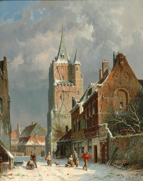
Adrianus Eversen's "Gezicht op een straatje te Harderwijk" exemplifies the Dutch Romanticism that dominated landscape painting in the mid-nineteenth century. Created between 1828 and 1897, this work embodies the artist's unique blend of loose brushwork and attention to atmospheric detail. The palette of pale earth tones, muted greens, soft reds, and browns imbues the scene with an air of serenity, as if the very sky itself had been distilled into a gentle mist.
As we consider the artwork in its intended scale of 54x44 inches, the spatial depth created by Eversen's use of chiaroscuro assumes greater prominence. The chromatic structure, though muted, yields a nuanced balance of cool and warm tones that would harmonize well with rich wood tones and limestone surfaces often found in luxury interiors. When paired with materials such as hand-troweled plaster or woven textiles, the atmospheric weight of the painting is accentuated, casting dappled shadows across nearby surfaces. The architectural scale behavior of "Gezicht op een straatje te Harderwijk" encourages a contemplative spatial rhythm, inviting viewers to linger within its tranquil landscape.
The rustic design style evident in Eversen's work would find an apt complement in country-inspired furnishings and decorative arts, such as hand-carved wooden chests or antique stone vases. When juxtaposed with more refined elements like polished metalwork or crystal glass, the painting's modesty is subtly offset by its understated elegance.
Upon enlargement, the loose brushstrokes that defined Eversen's style become even more expressive, imbuing the scene with an organic sense of movement. This kinetic quality is further amplified by the artist's deliberate use of atmospheric perspective, which creates a subtle sense of depth and recession within the composition. In this way, "Gezicht op een straatje te Harderwijk" serves not merely as a static image but as a dynamic element within the luxury interior environment.
The design styles that inform Eversen's work – rustic and country – possess an enduring appeal that transcends their historical context. These aesthetic sensibilities would prove particularly apt in environments seeking to evoke a sense of understated refinement, where rich materials and subtle coloration converge to create a soothing yet sophisticated ambiance.
In the company of "Gezicht op een straatje te Harderwijk", we find ourselves immersed within a world of gentle contrasts: warm light dissolving into cool shadow; rough-hewn stone yielding to soft, billowy clouds. The painting's influence extends beyond its visual qualities, however, as it also speaks to the importance of balance and proportion in design.
Through Eversen's masterful manipulation of spatial depth and chromatic structure, "Gezicht op een straatje te Harderwijk" assumes a position at the very heart of Dutch Romanticism. Its consideration within a luxury interior environment would be as an exercise in restraint and nuance – an acknowledgment that beauty often resides not in grand statement but in subtle suggestion.
Eversen's loose brushwork imbues "Gezicht op een straatje te Harderwijk" with a fluid, almost kinetic quality. This dynamism is expertly tempered by the artist's attention to atmospheric detail, creating a scene of quiet contemplation that invites viewers to linger within its tranquil world.
Upon enlargement, the composition's spatial rhythm becomes even more pronounced, encouraging a measured pace and deliberate movement through the space. The design styles evident in Eversen's work – rustic and country – lend themselves particularly well to environments where an understated elegance is sought.
The chromatic structure of
This edition adapts fluidly across contemporary interior profiles, offering a stable architectural anchor.
Architectural Behavior
Its horizontal span reinforces axial movement across long architectural planes.
This edition functions as a 54x44 interior anchor, shaping spatial rhythm and establishing a stable visual cadence within the surrounding architecture.
Its chromatic structure responds to natural and artificial lighting, modulating depth and atmospheric weight throughout the day.
Recommended material pairings include natural oak, brushed metal, matte stone composites, and textured linen surfaces.
Gallery Edition Specifications
- Format: 54" x 44" Interior Architectural Study
- Medium: 330gsm Ultra-Premium Fine Art Matte
- Ink System: Wide-gamut archival pigment curation
- Mounting: Delivered unframed for professional gallery installation
Each edition is prepared to order. Gallery-standard quality control requires 3 to 5 business days.