Curatorial Narrative
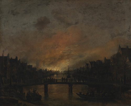
Aert van der Neer's "Fire at Amsterdam by Night" is a seminal work within the Baroque tradition of Dutch landscape painting. Created in 1650, it exemplifies the artist's unique technical approach, characterized by an impasto style that imbues the canvas with a tactile quality. The use of thick brushstrokes and textured paint creates an almost three-dimensional effect, drawing the viewer into the nocturnal scene.
The palette employed by van der Neer is notable for its dark browns and muted oranges, which serve to heighten the atmospheric weight of the composition. The black silhouettes of the buildings, contrasted with the warm tones of the night sky, create a sense of depth that underscores the artist's intent to capture the fleeting effects of light on urban landscapes.
As "Fire at Amsterdam by Night" is enlarged to 54x44 feet, its spatial rhythm and chromatic structure become even more pronounced. The dark browns and blacks seem to devour the space, creating an immersive atmosphere that envelops the viewer. In a luxury interior setting, this scale can be used to create a dramatic focal point, with the surrounding architecture designed to complement the painting's atmospheric weight.
In terms of material pairing, the textured paint would pair well with materials like rough-hewn stone or hand-forged metal, which share similar tactile qualities. Lighting behavior is also crucial, as subtle uplighting can emphasize the painting's three-dimensional effect while avoiding harsh contrasts that might detract from its atmospheric intent. When considering spatial impact, the painting's use of depth and perspective would be well-suited to a grand entrance or stairway, where its vertical orientation can create a sense of flow and movement.
This edition's spatial clarity and controlled palette align naturally with modernist interiors.
Architectural Behavior
Its horizontal span reinforces axial movement across long architectural planes.
This edition functions as a 54x44 interior anchor, shaping spatial rhythm and establishing a stable visual cadence within the surrounding architecture.
Its chromatic structure responds to natural and artificial lighting, modulating depth and atmospheric weight throughout the day.
Recommended material pairings include natural oak, brushed metal, matte stone composites, and textured linen surfaces.
Gallery Edition Specifications
- Format: 54" x 44" Interior Architectural Study
- Medium: 330gsm Ultra-Premium Fine Art Matte
- Ink System: Wide-gamut archival pigment curation
- Mounting: Delivered unframed for professional gallery installation
Each edition is prepared to order. Gallery-standard quality control requires 3 to 5 business days.