Curatorial Narrative
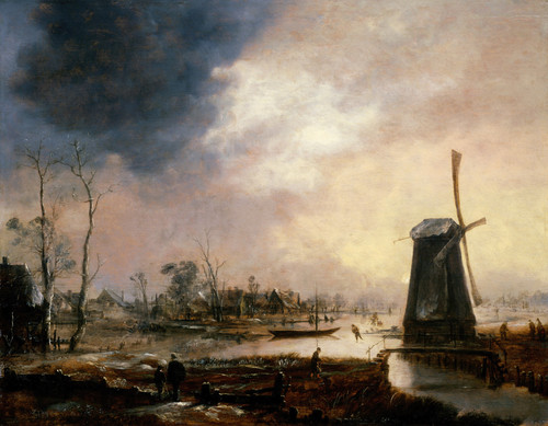
In the rarefied world of Dutch Golden Age landscape painting, Aert van der Neer's Winter Landscape near a Town with Bare Trees stands as a testament to the artist's nuanced mastery of atmospheric perspective. Created circa 1650-1655, this work exemplifies the stylistic conventions of its era while simultaneously hinting at the modernist tendencies that would later define art movements in the following centuries.
As one delves into the painting's chromatic structure, the blues and grays predominate, imbuing the scene with a somber, contemplative mood. The sparse distribution of browns and whites serves to emphasize the stark beauty of winter's barren landscape, while the fine brushwork lends an air of delicacy to the composition. When enlarged, the spatial rhythm of Winter Landscape near a Town with Bare Trees reveals itself in the interplay between the deep, receding planes of the trees and the more proximate, textured foreground. In an interior environment, this dynamic would pair well with materials such as warm woods and gray stones, which would not only complement the painting's chromatic structure but also create a sense of visual continuity.
The atmospheric weight of Winter Landscape near a Town with Bare Trees would manifest in a luxurious interior setting through strategic lighting. A combination of soft, diffused illumination and targeted highlights would draw out the nuances of the painting's composition, while a judicious use of reflective surfaces would amplify the spatial depth created by van der Neer's masterful deployment of atmospheric perspective.
In terms of material pairing, the spare, minimalist quality of Winter Landscape near a Town with Bare Trees would find an apt companion in sleek, low-profile furniture and carefully selected textiles. The overall effect would be one of understated elegance, as if the painting had been designed to occupy its space from the outset. As such, it would serve as a powerful reminder that even the most seemingly abstract or non-representational artworks can possess a profound ability to structure our perceptions of the world around us.
This edition's spatial clarity and controlled palette align naturally with modernist interiors.
Architectural Behavior
Its horizontal span reinforces axial movement across long architectural planes.
This edition functions as a 51x44 interior anchor, shaping spatial rhythm and establishing a stable visual cadence within the surrounding architecture.
Its chromatic structure responds to natural and artificial lighting, modulating depth and atmospheric weight throughout the day.
Recommended material pairings include natural oak, brushed metal, matte stone composites, and textured linen surfaces.
Gallery Edition Specifications
- Format: 51" x 44" Interior Architectural Study
- Medium: 330gsm Ultra-Premium Fine Art Matte
- Ink System: Wide-gamut archival pigment curation
- Mounting: Delivered unframed for professional gallery installation
Each edition is prepared to order. Gallery-standard quality control requires 3 to 5 business days.