Curatorial Narrative
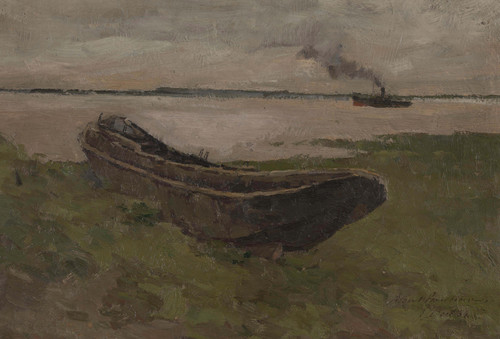
In 1887, Albert Baertsoen's "De Schelde in Dendermonde" situated itself within the fledgling Impressionist movement, where the painterly tradition was being reevaluated by artists seeking to capture the ephemeral effects of light and atmosphere. Baertsoen's technique, characterized by thick impasto brushstrokes, imbues the painting with a tangible, almost sculptural quality that underscores its emphasis on the tactile experience of landscape. The artist's palette, dominated by muted greens, grays, and browns, serves to evoke a sense of temporal depth, while the strategic use of red accents – particularly in the brick building that anchors the composition – injects a dynamic note into what would otherwise be a subdued color scheme.
Upon enlargement to approximately 48x44 inches, Baertsoen's "De Schelde in Dendermonde" reveals a complex interplay between spatial rhythm and chromatic structure. The impasto brushstrokes that define the painting's texture also create a series of visual planes that interact with one another, generating a sense of depth and atmospheric weight. In a luxury interior environment, this work would likely be paired with materials that echo its earthy palette – perhaps limestone or travertine – to create a harmonious dialogue between the artwork and its surroundings. The painting's subdued color scheme would also lend itself well to the judicious use of lighting, allowing for a range of effects from soft, ambient glow to more dramatic highlighting that draws attention to specific aspects of the composition. Ultimately, "De Schelde in Dendermonde" exerts a measured influence on its surroundings, its atmospheric weight and spatial complexity serving to underscore the importance of nuance and restraint in high-end interior design.
This edition's spatial clarity and controlled palette align naturally with modernist interiors.
Architectural Behavior
Its horizontal span reinforces axial movement across long architectural planes.
This edition functions as a 48x44 interior anchor, shaping spatial rhythm and establishing a stable visual cadence within the surrounding architecture.
Its chromatic structure responds to natural and artificial lighting, modulating depth and atmospheric weight throughout the day.
Recommended material pairings include natural oak, brushed metal, matte stone composites, and textured linen surfaces.
Gallery Edition Specifications
- Format: 48" x 44" Interior Architectural Study
- Medium: 330gsm Ultra-Premium Fine Art Matte
- Ink System: Wide-gamut archival pigment curation
- Mounting: Delivered unframed for professional gallery installation
Each edition is prepared to order. Gallery-standard quality control requires 3 to 5 business days.