Curatorial Narrative
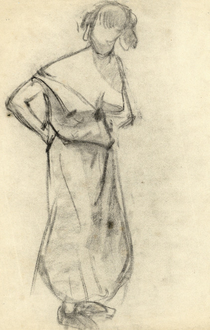
Staande figuur by Albert Daenens embodies the essence of Abstract Expressionism, a style characterized by spontaneous gesture and emotional intensity. The artist's bold yet precise brushwork imbues the composition with a dynamic energy that permeates every layer of pigment. In stark contrast to the often-overwrought figurative works of his contemporaries, Daenens' Staande figuur instead presents a minimalist framework for exploring the human form.
As an edition specifically designed to fill a 44x66 format, Staande figuur assumes a commanding presence within its assigned spatial context. The black and white palette creates a visual hierarchy that guides the viewer's attention through intricate gradations of value and texture. The reductionist design style lends itself beautifully to pairing with polished metallic surfaces or rich wood tones, allowing the artwork to assume a position of quiet authority amidst luxurious surroundings.
The atmospheric weight of Staande figuur is further amplified by its deployment of negative space, creating an almost palpable sense of depth and visual tension within a room. When illuminated from above, the black grounds seem to recede into the background, while the finely nuanced white forms appear to hover with a weightlessness that belies their physical presence. The overall effect is one of deliberate restraint, inviting the viewer to engage with the artwork on its own terms rather than being overwhelmed by its sheer scale or visual drama.
Daenens' masterful use of chromatic structure imbues Staande figuur with an almost three-dimensional quality, as if the black and white forms might suddenly detach themselves from their two-dimensional surface and occupy a space adjacent to the viewer. This spatial rhythm is at once disorienting and mesmerizing, drawing the eye into a vortex of visual activity that defies easy interpretation.
Within a luxury interior environment, Staande figuur assumes a position of quiet contemplation, its minimalist design style inviting pairing with sleek surfaces and precision-crafted furniture. The artwork's deliberate restraint also allows it to harmonize with an array of lighting fixtures, from low-key floor lamps to dramatic chandeliers, creating a seamless visual continuum that dissolves the boundaries between art and environment.
The reduced color palette of Staande figuur proves unexpectedly versatile when paired with a range of materials and textures, from rough-hewn wood to smooth glass or polished stone. In this context, the artwork assumes an almost sculptural quality, its carefully calibrated balance of positive and negative forms seeming to shift and adapt in response to changing environmental conditions.
In addition to its purely visual properties, Staande figuur also engages with the viewer on a deeply spatial level, drawing attention to the ways in which our perceptions are conditioned by the physical environment. By inviting us to engage with an abstracted yet still figurative form, Daenens' artwork subtly recalibrates our relationship with the spaces we inhabit, encouraging us to reevaluate the role of art within the broader landscape of human experience.
The precise control exerted over every brushstroke and pigment gradation imbues Staande figuur with a sense of almost clinical detachment, as if the artist were conducting an experiment in visual perception rather than expressing a personal vision. This tension between spontaneity and control is at once fascinating and unsettling, drawing us inexorably into a world of abstracted forms and ambiguous meanings.
Within a luxury interior environment, Staande figuur assumes a position of deliberate understatement, its reduced color palette and minimalist design style inviting pairing with an array of materials and textures. The artwork's carefully calibrated balance of positive and negative forms creates a visual hierarchy that is at once disorienting and mesmerizing, drawing the eye into a vortex of visual activity that defies easy interpretation.
Daenens' use of black and white pigment imbues
This edition's spatial clarity and controlled palette align naturally with modernist interiors.
Architectural Behavior
Its vertical rise introduces a stabilizing architectural counterpoint.
This edition functions as a 44x66 interior anchor, shaping spatial rhythm and establishing a stable visual cadence within the surrounding architecture.
Its chromatic structure responds to natural and artificial lighting, modulating depth and atmospheric weight throughout the day.
Recommended material pairings include natural oak, brushed metal, matte stone composites, and textured linen surfaces.
Gallery Edition Specifications
- Format: 44" x 66" Interior Architectural Study
- Medium: 330gsm Ultra-Premium Fine Art Matte
- Ink System: Wide-gamut archival pigment curation
- Mounting: Delivered unframed for professional gallery installation
Each edition is prepared to order. Gallery-standard quality control requires 3 to 5 business days.