Curatorial Narrative
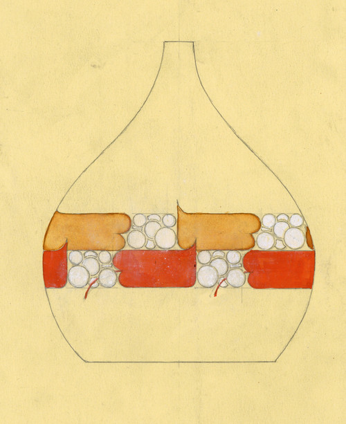
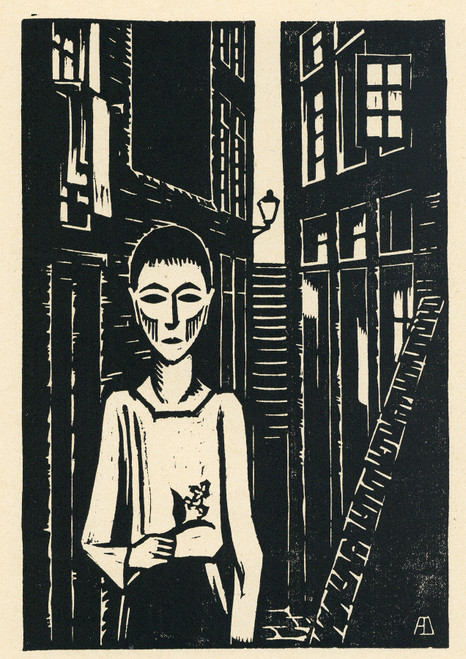
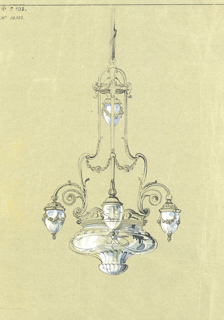
In the realm of figurative painting, "Toegepaste Kunst" by Albert Daenens assumes an enigmatic position, oscillating between the formal restraint of classical design and the sumptuousness of Victorian ornamentation. Executed with fine brushwork, the artist's technique imbues the composition with a sense of delicacy, underscoring the intricate balance between representational detail and atmospheric subtlety.
The neutral tones that predominate in the palette create an unobtrusive backdrop for the subtle nuances of blue shading, which infuse the scene with an almost imperceptible depth. As one navigates this visual terrain, a classical spatial rhythm emerges, its measured cadence punctuated by the Victorian penchant for ornate detail. When enlarged to 44x62, the composition's chromatic structure assumes a more pronounced role, as the interplay between light and shadow imbues the scene with an almost palpable atmospheric weight.
The artist's manipulation of spatial depth creates a sense of contained grandeur, as if the viewer has stumbled upon a hitherto concealed interior world. In a luxury setting, this dynamic would find itself in harmony with opulent materials such as marble or richly veined stone, while the subtle blue shading might be echoed by the gentle sheen of silk or velvet upholstery. As one contemplates "Toegepaste Kunst" within an architectural context, its spatial impact becomes most apparent, as if the very walls and ceiling have been subtly rearranged to accommodate the painting's measured proportions.
When installed at a large scale, the composition assumes a commanding presence, its atmospheric weight necessitating judicious placement to avoid overwhelming the surrounding space. Yet it is precisely this quality of deliberate restraint that renders "Toegepaste Kunst" so compelling within an architectural context – for in its subtle interplay between spatial rhythm and chromatic structure lies a quiet authority, one that would find itself naturally paired with refined materials and thoughtful lighting design.
Within a luxury interior environment, the composition's measured proportions would complement a range of architectural styles, from the grandeur of a Victorian mansion to the restrained elegance of a modern penthouse. Its subtle blue shading might be echoed by the gentle sheen of polished metal or the soft glow of strategically placed candelabras, while its spatial depth creates an almost palpable sense of contained grandeur.
The artist's classical training is evident in his manipulation of spatial rhythm and chromatic structure, as he balances the intricate detail of Victorian ornamentation with a measured restraint that underscores the painting's underlying formalism.
This edition adapts fluidly across contemporary interior profiles, offering a stable architectural anchor.
Architectural Behavior
Its vertical rise introduces a stabilizing architectural counterpoint.
This edition functions as a 44x62 interior anchor, shaping spatial rhythm and establishing a stable visual cadence within the surrounding architecture.
Its chromatic structure responds to natural and artificial lighting, modulating depth and atmospheric weight throughout the day.
Recommended material pairings include natural oak, brushed metal, matte stone composites, and textured linen surfaces.
Gallery Edition Specifications
- Format: 44" x 62" Interior Architectural Study
- Medium: 330gsm Ultra-Premium Fine Art Matte
- Ink System: Wide-gamut archival pigment curation
- Mounting: Delivered unframed for professional gallery installation
Each edition is prepared to order. Gallery-standard quality control requires 3 to 5 business days.