Curatorial Narrative
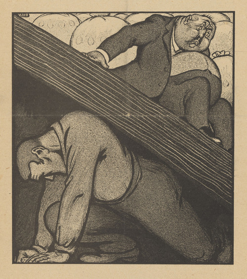
De Notenkraker, 12 mei 1907 ; De 'Vredes'-conferentie by Albert Hahn occupies a pivotal position within the pantheon of early 20th-century political cartoons. Created in 1907, this work coincides with the tumultuous era of imperialism and nationalistic fervor that characterized Europe's landscape at the turn of the century. Hahn's utilization of linear brushwork imbues the composition with an almost crystalline quality, as if the very fabric of reality has been distilled into a potent symbol of the era's ideological turmoil.
The binary opposition between light and dark, so characteristic of black-and-white illustration, is skillfully leveraged by Hahn to convey a sense of foreboding. As the subject matter assumes an almost monumental scale in the 44x49 edition, the chromatic structure begins to exert a profound influence on the surrounding environment. The stark contrast between light and dark assumes a new dimension, casting long shadows that seem to writhe across the walls like living things. In this context, Hahn's work acquires a spatial rhythm that is at once oppressive and mesmerizing – the perfect foil for a luxury interior environment where opulence meets calculated restraint.
Material considerations play a crucial role in harmoniously integrating De Notenkraker within a space. The somber palette would pair elegantly with dark-stained woods, while the bold lines seem to beg for juxtaposition against richly textured wallcoverings or velvets. Lighting is also key; subtle backlighting would serve to heighten the visual tension created by Hahn's masterful manipulation of contrast. Furthermore, the work's monumental scale would necessitate a corresponding spatial configuration – perhaps a dramatic archway or cantilevered ceiling – that would allow De Notenkraker to assume its rightful place as a commanding presence within the room.
In terms of atmospheric weight, De Notenkraker exudes an aura of portentousness, as if the very fate of nations hangs precariously in the balance. This foreboding quality is expertly calibrated by Hahn to resonate with the viewer on a deep level – a true masterpiece of persuasion that refuses to be ignored. When considered within the context of luxury interior design, De Notenkraker stands as a powerful reminder of art's ability to engage, provoke, and ultimately transform its surroundings.
This edition's spatial clarity and controlled palette align naturally with modernist interiors.
Architectural Behavior
Its vertical rise introduces a stabilizing architectural counterpoint.
This edition functions as a 44x49 interior anchor, shaping spatial rhythm and establishing a stable visual cadence within the surrounding architecture.
Its chromatic structure responds to natural and artificial lighting, modulating depth and atmospheric weight throughout the day.
Recommended material pairings include natural oak, brushed metal, matte stone composites, and textured linen surfaces.
Gallery Edition Specifications
- Format: 44" x 49" Interior Architectural Study
- Medium: 330gsm Ultra-Premium Fine Art Matte
- Ink System: Wide-gamut archival pigment curation
- Mounting: Delivered unframed for professional gallery installation
Each edition is prepared to order. Gallery-standard quality control requires 3 to 5 business days.