Curatorial Narrative
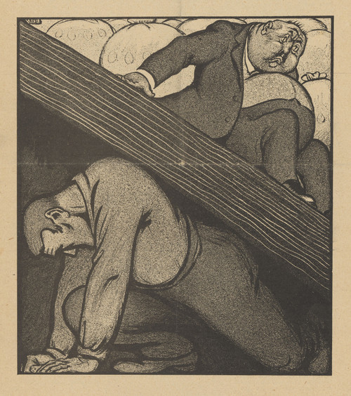
As we navigate the intricate realm of early 20th-century caricature, Albert Hahn's De Notenkraker, 19 januari 1907; De Paus tegen Frankrijk emerges as a masterful exemplar of modernist visual wit. Created in 1907, this work embodies the stylistic and tonal nuances characteristic of the era's avant-garde movements. Hahn's linear brushwork imbues the composition with an almost palpable sense of energy, as if the ink itself has been electrified by the artist's hand.
The work's figurative subject matter is juxtaposed with a stark black-and-white palette, conjuring an atmosphere redolent of graphic satire. The composition's geometric structure and use of negative space create a spatial rhythm that underscores the work's Modernist underpinnings. When enlarged to 44x49 inches, the image assumes a commanding presence in the luxury interior environment, its chromatic structure exerting an intense atmospheric weight that can either energize or disrupt the surrounding space.
As De Notenkraker, 19 januari 1907; De Paus tegen Frankrijk is enlarged and situated within the opulent context of high-end design, several material pairing considerations come into play. A polished chrome frame could serve to accentuate the work's modernist lines, while a matte-black surround would allow its somber tone to dominate the space. When lit from behind, the image's inkwork assumes an almost three-dimensional quality, as if Hahn's linear strokes are now sculpting the very air itself.
In terms of spatial impact, De Notenkraker, 19 januari 1907; De Paus tegen Frankrijk occupies a unique position within the luxury interior. Its imposing scale and stark palette function to create a sense of visual tension, drawing the viewer's eye inexorably towards the work's central image. The Modernist underpinnings of the composition also lend themselves readily to pairing with sleek, minimalist furnishings, while its graphic energy would be amplified by judicious use of bold, geometric patterns in upholstery or wallpaper.
The work's atmospheric weight is further heightened when situated within a room featuring an abundance of dark wood and rich textiles. In such contexts, De Notenkraker, 19 januari 1907; De Paus tegen Frankrijk assumes a commanding presence that belies its relatively modest size, effectively dominating the surrounding space with its graphic intensity and tonal complexity.
As we consider the various material pairings and spatial arrangements possible for this edition of Hahn's work, it becomes clear that De Notenkraker, 19 januari 1907; De Paus tegen Frankrijk is far more than a simply decorative object – rather, it serves as a visual catalyst, imbuing its surroundings with an unmistakable sense of modernist élan.
This edition's spatial clarity and controlled palette align naturally with modernist interiors.
Architectural Behavior
Its vertical rise introduces a stabilizing architectural counterpoint.
This edition functions as a 44x49 interior anchor, shaping spatial rhythm and establishing a stable visual cadence within the surrounding architecture.
Its chromatic structure responds to natural and artificial lighting, modulating depth and atmospheric weight throughout the day.
Recommended material pairings include natural oak, brushed metal, matte stone composites, and textured linen surfaces.
Gallery Edition Specifications
- Format: 44" x 49" Interior Architectural Study
- Medium: 330gsm Ultra-Premium Fine Art Matte
- Ink System: Wide-gamut archival pigment curation
- Mounting: Delivered unframed for professional gallery installation
Each edition is prepared to order. Gallery-standard quality control requires 3 to 5 business days.