Curatorial Narrative
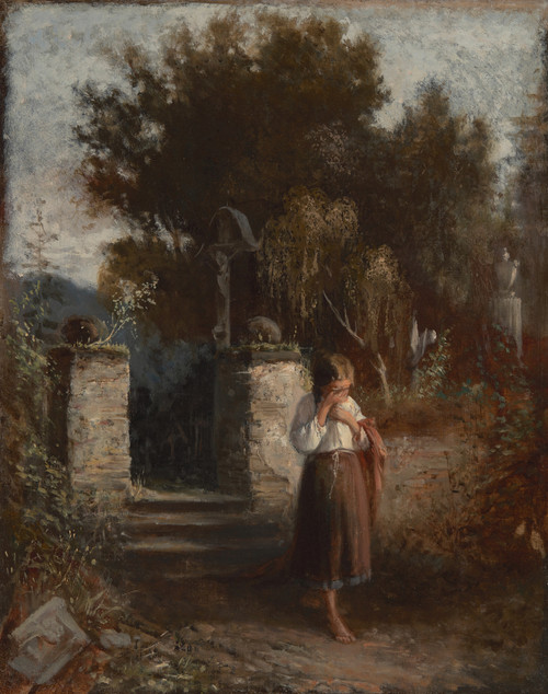
Aleksander Kotsis's "Highlander's Family" from 1869 occupies a significant juncture in the trajectory of Renaissance art, marking a deliberate divergence from the more austere forms that defined the preceding decades. As an artist who navigated the boundaries between traditionalism and innovation, Kotsis brought a distinct sensibility to his work, one characterized by an almost tactile engagement with paint. His use of impasto, for instance, imbues the surface with a palpable energy, as if the textures themselves are asserting their presence within the composition.
At 44x54 inches, "Highlander's Family" assumes a commanding presence in a luxury interior environment. The warm earth tones that predominate – muted browns, ochres, and soft whites – establish an atmospheric weight that is both soothing and contemplative. As the eye moves through the spatial rhythm established by Kotsis's design, it becomes clear that the chromatic structure has been deliberately calibrated to evoke a sense of reverence, rather than dynamism. The juxtaposition of rich materials such as wood paneling or stone with the subtle textures in "Highlander's Family" would be particularly effective, as the subdued palette allows for an almost seamless integration into a variety of architectural styles, from Renaissance Revival to more modern interpretations.
The spatial depth created by Kotsis's use of atmospheric perspective is another crucial aspect of his work's impact at this scale. As the eye travels through the composition, it encounters a series of subtle gradations in light and shadow, which imbue the scene with a sense of volume and three-dimensionality. This effect is particularly pronounced when paired with strategic lighting that draws attention to specific areas of the composition – for instance, highlighting the Highlander's rugged features or casting a soft glow on the surrounding family members.
In terms of material pairing, Kotsis's palette offers a range of possibilities, from the rich patina of aged wood to the cool, luminous tones of certain types of marble. In each case, the artist's use of muted colors and subtle textures creates an almost imperceptible threshold between the painting itself and its surroundings – a quality that would be particularly valuable in high-end interior design applications.
When viewed at 44x54 inches, "Highlander's Family" assumes a new level of authority within a luxury environment. Its atmospheric weight, spatial depth, and chromatic structure coalesce to create an almost meditative experience for the viewer. This is not to suggest that the artwork would dominate the space; rather, it would establish a harmonious dialogue with its surroundings – one characterized by an almost intuitive understanding of the interplay between material, light, and spatial rhythm.
This edition adapts fluidly across contemporary interior profiles, offering a stable architectural anchor.
Architectural Behavior
Its vertical rise introduces a stabilizing architectural counterpoint.
This edition functions as a 44x54 interior anchor, shaping spatial rhythm and establishing a stable visual cadence within the surrounding architecture.
Its chromatic structure responds to natural and artificial lighting, modulating depth and atmospheric weight throughout the day.
Recommended material pairings include natural oak, brushed metal, matte stone composites, and textured linen surfaces.
Gallery Edition Specifications
- Format: 44" x 54" Interior Architectural Study
- Medium: 330gsm Ultra-Premium Fine Art Matte
- Ink System: Wide-gamut archival pigment curation
- Mounting: Delivered unframed for professional gallery installation
Each edition is prepared to order. Gallery-standard quality control requires 3 to 5 business days.