Curatorial Narrative
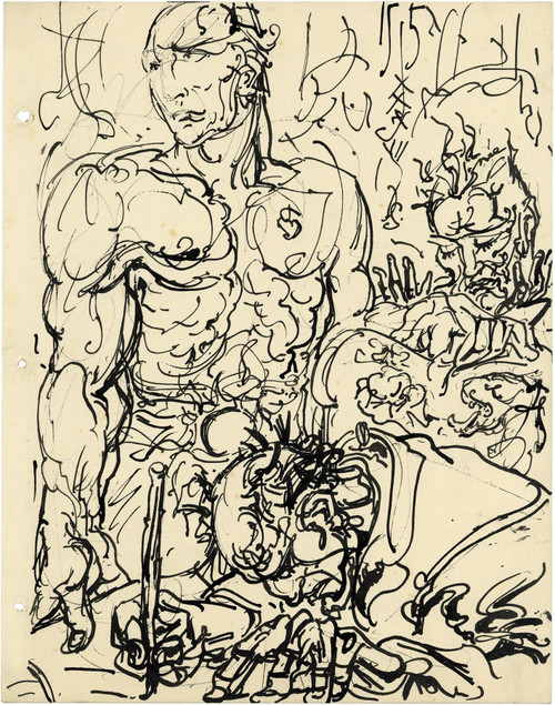
In the oeuvre of Alfred Ost, "Jongensgezicht" occupies a peculiar position, situated between the realism of his contemporaries and the emerging modernist tendencies of the early 20th century. The artist's technique is characterized by fine brushwork that imbues the canvas with a tangible, almost tactile quality, while the palette, dominated by neutral tones and earthy hues, creates an atmosphere of subdued introspection.
The artwork's minimalist design style, exemplified by its spare composition and limited chromatic structure, gives rise to a sense of spatial rhythm that is both calming and contemplative. When enlarged to 44x55, the painting's atmospheric weight becomes more pronounced, casting a gentle shadow on surrounding surfaces. This quality makes it an ideal companion piece for luxury interiors, where its minimalist profile can be paired with rich, textural materials like velvet or linen. The neutral palette, meanwhile, allows for flexible lighting behavior, accommodating both diffused natural light and focused artificial illumination. As such, "Jongensgeicht" assumes a significant role in shaping the spatial impact of an interior environment, its presence imbuing the space with a sense of calm, measured contemplation.
The artist's use of fine brushwork and understated color palette creates an intimate, almost diaphanous quality that invites close scrutiny. This subtlety lends itself particularly well to luxury interiors, where sumptuous materials and precise lighting can be employed to amplify the painting's atmospheric effects. In a room with high ceilings and abundant natural light, "Jongensgeicht" would create a soothing counterpoint to more dramatic design elements, its calm presence exerting a gentle influence on the spatial rhythm of the space.
The chromatic structure of the painting also makes it an effective choice for spaces with complex layouts or competing visual interests. By introducing a neutralizing element into the design equation, "Jongensgeicht" helps to stabilize the visual field, creating a sense of equilibrium that is both restorative and rejuvenating. This effect is particularly pronounced when paired with reflective surfaces like polished wood or glass, which can amplify the painting's atmospheric presence while also drawing attention to its own subtle beauty.
In a well-designed luxury interior, "Jongensgeicht" would assume a significant role in shaping the overall aesthetic experience. Its understated color palette and minimalist composition make it an ideal accompaniment for sumptuous materials like silk or cashmere, which can be employed to create rich, tactile environments that are both luxurious and soothing. The painting's fine brushwork also lends itself particularly well to high-contrast lighting situations, where the play of light on its surface creates a dynamic interplay between highlight and shadow.
The artist's use of earthy hues and neutral tones in "Jongensgeicht" serves not only to create an intimate atmosphere but also to ground the painting firmly within the world of human experience. This quality makes it an effective choice for luxury interiors, where the presence of art can serve as a reminder of the complexities and nuances of human existence. By introducing a sense of calm contemplation into the design equation, "Jongensgeicht" helps to create spaces that are both restorative and rejuvenating, inviting occupants to pause, reflect, and reconnect with their surroundings.
In conclusion, "Jongensgeicht" is a painting that rewards close attention and careful consideration. Its understated color palette and minimalist composition make it an effective choice for luxury interiors, where the presence of art can serve as a reminder of the complexities and nuances of human existence. By introducing a sense of calm contemplation into the design equation, "Jongensgeicht" helps to create spaces that are both restorative and
This edition's spatial clarity and controlled palette align naturally with modernist interiors.
Architectural Behavior
Its vertical rise introduces a stabilizing architectural counterpoint.
This edition functions as a 44x55 interior anchor, shaping spatial rhythm and establishing a stable visual cadence within the surrounding architecture.
Its chromatic structure responds to natural and artificial lighting, modulating depth and atmospheric weight throughout the day.
Recommended material pairings include natural oak, brushed metal, matte stone composites, and textured linen surfaces.
Gallery Edition Specifications
- Format: 44" x 55" Interior Architectural Study
- Medium: 330gsm Ultra-Premium Fine Art Matte
- Ink System: Wide-gamut archival pigment curation
- Mounting: Delivered unframed for professional gallery installation
Each edition is prepared to order. Gallery-standard quality control requires 3 to 5 business days.