Curatorial Narrative
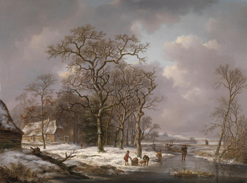
The winter landscape by Andreas Schelfhout, painted in 1844, occupies a distinct position within the Netherlandish tradition of landscape painting. Characterized by its fine brushwork and subtle palette, this work embodies the Baroque aesthetic that had been gaining momentum since the early 17th century. The artist's use of cool tones, particularly blue and gray, creates an atmospheric weight that draws the viewer into the frozen scene.
As one considers the scale at which this painting would be reproduced - specifically 58x44 inches - its spatial depth and chromatic structure become more pronounced. The warm browns of the trees and ice are juxtaposed with the cool tones of the castle walls, creating a tension between warmth and cold that is further accentuated by the red accents on the castle façade. This interplay of color yields a rich spatial rhythm that would be particularly effective in a luxury interior environment, where material pairing and lighting behavior could amplify its impact.
The subtle nuances of Schelfhout's brushwork and palette suggest a level of refinement and restraint that would be well-suited to an interior space with high-end finishes. The atmospheric weight created by the cool tones and blue undertones would also contribute to a sense of calm and contemplation, while the warm browns and red accents would introduce a hint of energy and dynamism. When scaled up to this size, the painting's spatial structure becomes more explicit, inviting the viewer to move through the scene in a way that feels both immersive and introspective.
When installed in a luxury interior environment, Schelfhout's winter landscape would likely be paired with materials such as dark woods, rich textiles, and metallic accents. The lighting scheme would also play a crucial role, as the interplay between warm and cool tones would be amplified by strategic use of ambient light sources. In this context, the painting's atmospheric weight and spatial rhythm would contribute to a sense of depth and visual interest that is both captivating and calming.
The scale at which this painting has been reproduced - 58x44 inches - highlights its ability to command attention in even the most refined interior environments. Its chromatic structure and spatial depth are particularly effective in creating a sense of drama and atmosphere, making it an excellent choice for spaces where a sense of luxury and refinement is paramount.
The winter landscape by Andreas Schelfhout presents a unique opportunity to engage with the aesthetic traditions of 19th century Netherlandish painting. Its subtle nuances of brushwork and palette create a rich spatial rhythm that would be well-suited to an interior space with high-end finishes, while its atmospheric weight and chromatic structure contribute to a sense of calm and contemplation.
In a luxury interior environment, Schelfhout's winter landscape would likely be installed in a way that maximizes its impact. The spatial depth created by the cool tones and blue undertones would be amplified by strategic use of ambient light sources, while the warm browns and red accents would introduce a hint of energy and dynamism. The material pairing and lighting behavior would also play a crucial role in amplifying the painting's visual interest and atmospheric weight.
The winter landscape by Andreas Schelfhout presents a unique opportunity to engage with the aesthetic traditions of 19th century Netherlandish painting. Its subtle nuances of brushwork and palette create a rich spatial rhythm that would be well-suited to an interior space with high-end finishes, while its atmospheric weight and chromatic structure contribute to a sense of calm and contemplation.
When scaled up to 58x44 inches, Schelfhout's winter landscape becomes even more effective at creating a sense of drama and atmosphere. Its spatial depth and chromatic structure are particularly effective in contributing to
This edition adapts fluidly across contemporary interior profiles, offering a stable architectural anchor.
Architectural Behavior
Its horizontal span reinforces axial movement across long architectural planes.
This edition functions as a 58x44 interior anchor, shaping spatial rhythm and establishing a stable visual cadence within the surrounding architecture.
Its chromatic structure responds to natural and artificial lighting, modulating depth and atmospheric weight throughout the day.
Recommended material pairings include natural oak, brushed metal, matte stone composites, and textured linen surfaces.
Gallery Edition Specifications
- Format: 58" x 44" Interior Architectural Study
- Medium: 330gsm Ultra-Premium Fine Art Matte
- Ink System: Wide-gamut archival pigment curation
- Mounting: Delivered unframed for professional gallery installation
Each edition is prepared to order. Gallery-standard quality control requires 3 to 5 business days.