Curatorial Narrative
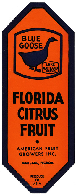
In the context of early 20th-century modernity, "Blue Goose Produce Label" by Anonymous occupies a liminal space between industrial design and fine art. Created during the mid-20th century, this work embodies the ascetic minimalism characteristic of its era, eschewing ornamentation for an austere emphasis on functionality.
The artist's deliberate deployment of orange, blue, and black creates a visually striking yet subdued chromatic structure that resists romanticism or sentimentality. As a figurative work within the parameters of industrial design, "Blue Goose Produce Label" exemplifies the Modernist preoccupation with the abstracted form. Its use of simple geometric shapes and absence of brushwork underscore an emphasis on materiality over expressiveness.
In its large-scale iteration of 44x112 inches, the artwork assumes a commanding presence that recalibrates the viewer's spatial rhythm. The dominant blue hue, reminiscent of industrial dyes, establishes a somber atmospheric weight that grounds the surrounding space. As the label's graphic components expand, their geometric relationships become more pronounced, imparting a sense of rigor and discipline to adjacent surfaces.
The large-scale "Blue Goose Produce Label" demands consideration of material pairing and lighting behavior within a luxury interior environment. The artwork's matte finish necessitates strategic juxtaposition with luminous or reflective surfaces to create visual tension. Conversely, when paired with dark or muted materials, the label's blue hue can amplify their somber tone, effectively subordinating its own presence while maintaining an overarching sense of cohesion.
Upon installation, "Blue Goose Produce Label" modulates the spatial impact of adjacent architectural elements, recalibrating the viewer's perception of volume and depth. The artwork's stark color palette and graphic simplicity imbue the surrounding space with a heightened sense of order, subtly redirecting attention towards its abstracted form. In this context, the label assumes an almost sculptural presence, elevating its industrial origins to a refined, modernist art object that coexists harmoniously within an upscale interior environment.
This edition's spatial clarity and controlled palette align naturally with modernist interiors.
Architectural Behavior
Its vertical rise introduces a stabilizing architectural counterpoint.
This edition functions as a 44x112 interior anchor, shaping spatial rhythm and establishing a stable visual cadence within the surrounding architecture.
Its chromatic structure responds to natural and artificial lighting, modulating depth and atmospheric weight throughout the day.
Recommended material pairings include natural oak, brushed metal, matte stone composites, and textured linen surfaces.
Gallery Edition Specifications
- Format: 44" x 112" Interior Architectural Study
- Medium: 330gsm Ultra-Premium Fine Art Matte
- Ink System: Wide-gamut archival pigment curation
- Mounting: Delivered unframed for professional gallery installation
Each edition is prepared to order. Gallery-standard quality control requires 3 to 5 business days.