Curatorial Narrative
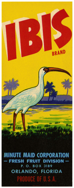
Created between 1930 and 1950, "Circle Brand Fine Citrus Fruit Label" by Anonymous sits at the nexus of Art Deco's machine-age fascination and Modernist's rejection of ornament. The anonymous artist's technique, while not beholden to traditional brushwork, employs a crisp, graphic language that recalls the era's typographic innovations. A palette of black, red, yellow, green, blue, and orange, arranged in a deliberate circle, evokes an atmosphere of precision and control.
At the scale of 44x110, "Circle Brand Fine Citrus Fruit Label" assumes a commanding presence, its chromatic structure unfolding like a spatial rhythm that draws the viewer's eye. The black circle provides a solid foundation for the vibrant hues to dance around, creating a sense of atmospheric weight that anchors the surrounding interior environment. When paired with materials such as polished chrome or dark wood, the artwork's bold coloration assumes a luxurious sheen, while its graphic structure creates a harmonious tension with the spatial rhythms of a high-end space. As the ambient lighting adjusts to highlight different facets of the artwork, the blue and green tones deepen, imbuing the surrounding area with an air of sophistication that resonates through the carefully selected materials and textures.
In this context, the artist's decision to forgo representational imagery in favor of a graphic abstraction creates a sense of disconnection from the fruit itself, allowing the viewer to focus instead on the aesthetic qualities of the label as a designed object. The anonymous artist's use of Art Deco motifs and Modernist restraint results in a work that is at once both nostalgic for the past and forward-thinking in its visual language.
The large-scale installation of "Circle Brand Fine Citrus Fruit Label" invites a reevaluation of the artwork as a functional element within the luxury interior, one that engages with the viewer on multiple levels. By situating the piece above a console table or against a dramatic wall, the designer can amplify the spatial impact of the work, leveraging its bold coloration and graphic structure to create a visually striking focal point.
When considered in conjunction with the surrounding architectural features, the artwork's chromatic structure creates a sense of dialogue between the different elements of the space. The blue and green tones, in particular, seem to harmonize with the ambient lighting, imbuing the area with an air of refinement that is heightened by the strategic placement of complementary materials.
By incorporating "Circle Brand Fine Citrus Fruit Label" into the interior environment, the designer can create a sense of cohesion between disparate elements, from the polished chrome fixtures to the dark wood paneling. The artwork's use of Art Deco motifs and Modernist restraint creates a visual language that is both nostalgic for the past and forward-thinking in its aesthetic.
In its treatment of scale and materiality, "Circle Brand Fine Citrus Fruit Label" offers a unique opportunity for the interior designer to explore new possibilities in spatial arrangement and chromatic structure. By reimagining the work as a designed object, rather than simply a print or graphic element, the designer can unlock its full potential as a functional component within the luxury interior environment.
When installed at 44x110, "Circle Brand Fine Citrus Fruit Label" assumes a commanding presence that is both visually striking and architecturally relevant. Its use of bold coloration and graphic structure creates a sense of tension between different elements of the space, while its chromatic structure engages with the surrounding materials in a way that is both harmonious and refined.
In its treatment of spatial rhythm and atmospheric weight, "Circle Brand Fine Citrus Fruit Label" offers a unique opportunity for the interior designer to explore new possibilities in material pairing and lighting behavior. By situating the work above
This edition's spatial clarity and controlled palette align naturally with modernist interiors.
Architectural Behavior
Its vertical rise introduces a stabilizing architectural counterpoint.
This edition functions as a 44x110 interior anchor, shaping spatial rhythm and establishing a stable visual cadence within the surrounding architecture.
Its chromatic structure responds to natural and artificial lighting, modulating depth and atmospheric weight throughout the day.
Recommended material pairings include natural oak, brushed metal, matte stone composites, and textured linen surfaces.
Gallery Edition Specifications
- Format: 44" x 110" Interior Architectural Study
- Medium: 330gsm Ultra-Premium Fine Art Matte
- Ink System: Wide-gamut archival pigment curation
- Mounting: Delivered unframed for professional gallery installation
Each edition is prepared to order. Gallery-standard quality control requires 3 to 5 business days.