Curatorial Narrative
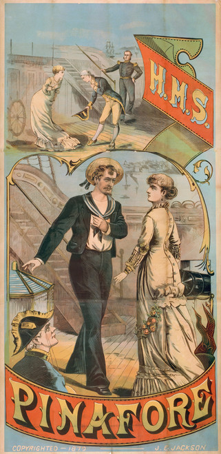
Danger ahead, created in 1890 by an anonymous artist, occupies a unique position within the figural tradition of the late nineteenth century. The fine brushwork employed in this work is characteristic of a specific period in art history, one marked by a deliberate rejection of the heavy, opaque brushstrokes that had become synonymous with earlier figurative painting. Instead, the artist has opted for a more nuanced, expressive approach that imbues the subject with an almost ethereal quality.
The pastel blues and soft whites used in Danger ahead are carefully balanced against the earthy browns and muted greens to create a sense of spatial rhythm that is at once calming yet subtly disquieting. When enlarged to 44x90, this balance of colors becomes even more pronounced, as the chromatic structure begins to exert an almost palpable influence on the surrounding environment. The atmospheric weight of the painting shifts, deepening and darkening in areas where the viewer's gaze lingers. Material pairing becomes critical here, with the introduction of rich textures – perhaps a velvet sofa or a linen-covered wall – serving to further amplify the painting's emotional resonance.
The spatial depth achieved by the artist through the use of atmospheric perspective creates an almost palpable sense of volume within the interior space, drawing the viewer into a world that is at once familiar yet unsettling. In this context, lighting becomes a crucial factor, as the careful placement of light sources serves to accentuate specific areas of the composition and heighten the overall sense of tension. As the painting asserts its presence in the luxury interior environment, it assumes a new level of significance, one that transcends the purely decorative to become an integral part of the space's underlying structure.
This edition adapts fluidly across contemporary interior profiles, offering a stable architectural anchor.
Architectural Behavior
Its vertical rise introduces a stabilizing architectural counterpoint.
This edition functions as a 44x90 interior anchor, shaping spatial rhythm and establishing a stable visual cadence within the surrounding architecture.
Its chromatic structure responds to natural and artificial lighting, modulating depth and atmospheric weight throughout the day.
Recommended material pairings include natural oak, brushed metal, matte stone composites, and textured linen surfaces.
Gallery Edition Specifications
- Format: 44" x 90" Interior Architectural Study
- Medium: 330gsm Ultra-Premium Fine Art Matte
- Ink System: Wide-gamut archival pigment curation
- Mounting: Delivered unframed for professional gallery installation
Each edition is prepared to order. Gallery-standard quality control requires 3 to 5 business days.