Curatorial Narrative
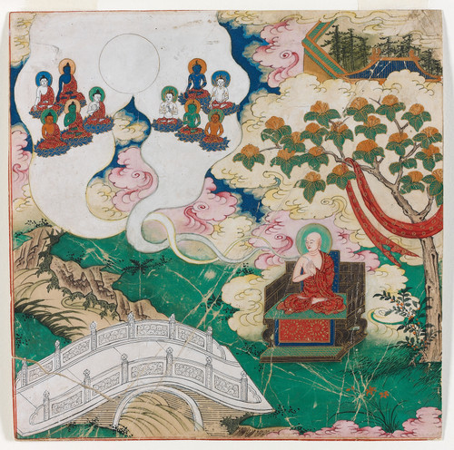
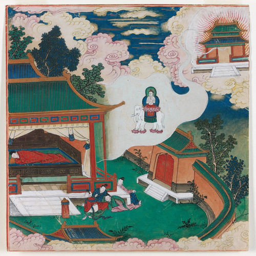
In the anonymous creation "De emblemen van de Vijf Boeddha's", we find a masterful example of Tibetan Thangka painting from the 18th century. The artist's deft brushwork imbues the botanical subject with an air of mysticism, as if the very essence of nature has been distilled onto the surface. The intricate rendering of leaves and petals in shades of reds, greens, blues, golds, pinks, and whites creates a visual tension that draws the viewer's eye into the composition.
The chromatic structure of this work is noteworthy for its deliberate balancing act between warm and cool tones. As one gazes upon the painting, the spatial rhythm of the elements seems to shift and undulate, like the gentle sway of lotus flowers in a still pond. The atmospheric weight of the painting's colors is substantial enough to anchor a room's decor without overpowering it, much like the role that a richly textured area rug might play in defining a space's character.
When enlarged to 44x44, the painting's palette assumes an even more dramatic presence, its bold hues and intricate textures demanding attention. The spatial depth created by the layered composition and delicate brushstrokes appears to expand and contract depending on one's vantage point, much like the way that natural light dancing through a skylight might transform a room's mood.
In a luxury interior environment, this painting would likely be paired with richly textured materials such as hand-hewn wood paneling or velvety upholstery in complementary hues. The atmospheric weight of the painting's colors would also play off the subtle nuances of lighting, perhaps through strategically placed sconces or recessed fixtures to create pools of warm light that highlight specific areas of the composition.
The spatial impact of this piece is considerable, as its deliberate balance between warm and cool tones creates a sense of equilibrium in even the most dramatic spaces. The painting's ability to anchor a room's decor without overpowering it makes it an excellent choice for a prominent wall in a high-end interior environment.
This edition's spatial clarity and controlled palette align naturally with modernist interiors.
Architectural Behavior
Its horizontal span reinforces axial movement across long architectural planes.
This edition functions as a 44x44 interior anchor, shaping spatial rhythm and establishing a stable visual cadence within the surrounding architecture.
Its chromatic structure responds to natural and artificial lighting, modulating depth and atmospheric weight throughout the day.
Recommended material pairings include natural oak, brushed metal, matte stone composites, and textured linen surfaces.
Gallery Edition Specifications
- Format: 44" x 44" Interior Architectural Study
- Medium: 330gsm Ultra-Premium Fine Art Matte
- Ink System: Wide-gamut archival pigment curation
- Mounting: Delivered unframed for professional gallery installation
Each edition is prepared to order. Gallery-standard quality control requires 3 to 5 business days.