Curatorial Narrative
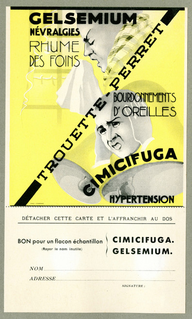
Fourreau de satin noir, created in 1912 by an anonymous artist, occupies a pivotal position within the trajectory of Art Nouveau's flowering. The work's fine brushwork, evident in the delicate folds of the velvet-like fabric, bespeaks a technical mastery consonant with the epoch's emphasis on haptic experience and manual dexterity.
The subject, rendered in stark black, white, red, and gray hues, appears to hover against a backdrop of atmospheric depth, its figurative essence simultaneously clarified and obfuscated by the artist's calculated deployment of chiaroscuro. As a visual entity, Fourreau de satin noir exists at an intriguing nexus between representational art and decorative design.
The spatial rhythm established by the painting's composition and palette behaves distinctly when enlarged to 44x73 inches. In this format, the chromatic structure, initially perceived as predominantly somber, assumes a more complex character. The juxtaposition of black, white, red, and gray creates an interplay of light and shadow that imbues the space with a heightened sense of atmosphere.
As the painting's spatial depth becomes more apparent at larger scale, its impact on material pairing becomes evident. Placed against walls painted in rich, cool hues, Fourreau de satin noir would establish a visual dialogue based on contrast rather than harmony. Conversely, paired with warm-toned woods or rich textiles, the painting would dissolve into the surrounding environment, assuming a more subtle role within the interior's spatial dynamics.
The lighting behavior of the artwork is equally important, as its fine brushwork and nuanced coloration create an interplay between direct illumination and ambient glow. This tension not only influences the overall ambiance but also modulates our perception of the space itself, fostering a sense of depth and dimensionality that would be difficult to achieve through other means.
Ultimately, Fourreau de satin noir's inclusion in a luxury interior environment serves as a counterpoint to more overtly decorative elements. Its understated yet insistent presence recalibrates our understanding of the space, inviting us to reassess the interplay between material, light, and structure.
This edition's spatial clarity and controlled palette align naturally with modernist interiors.
Architectural Behavior
Its vertical rise introduces a stabilizing architectural counterpoint.
This edition functions as a 44x73 interior anchor, shaping spatial rhythm and establishing a stable visual cadence within the surrounding architecture.
Its chromatic structure responds to natural and artificial lighting, modulating depth and atmospheric weight throughout the day.
Recommended material pairings include natural oak, brushed metal, matte stone composites, and textured linen surfaces.
Gallery Edition Specifications
- Format: 44" x 73" Interior Architectural Study
- Medium: 330gsm Ultra-Premium Fine Art Matte
- Ink System: Wide-gamut archival pigment curation
- Mounting: Delivered unframed for professional gallery installation
Each edition is prepared to order. Gallery-standard quality control requires 3 to 5 business days.