Curatorial Narrative
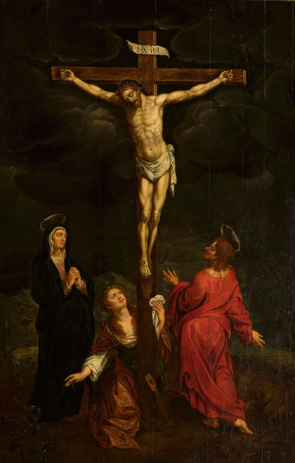
In the context of Art Deco's ascent in the 1940s, "Gedenkkaart voor de gevallenen" by Anonymous occupies a pivotal position. The artwork's decorative style, exemplified by its use of linear brushwork and ornate patterns, nods to the era's fascination with luxury and opulence. However, beneath its Art Deco façade lies a deeper engagement with the genre scene, as exemplified by its depiction of a somber, melancholic atmosphere.
As "Gedenkkaart voor de gevallenen" is enlarged to 44x68, its palette undergoes a profound transformation. The beige and red tones assume a more nuanced quality, their chromatic structure imbuing the surrounding space with a sense of atmospheric weight. The blue accents, meanwhile, serve as a counterpoint to the warmth of the reds, introducing an element of coolness that underscores the artwork's somber intent. In a luxury interior environment, these qualities would pair particularly well with rich materials such as velvet and marble, their subtle sheen amplifying the artwork's chromatic structure.
When hung in a space designed for maximum spatial rhythm, "Gedenkkaart voor de gevallenen" assumes a commanding presence, its linear composition governing the viewer's eye. The artwork's design is thus perfectly suited to environments characterized by clean lines and geometric forms, where its Art Deco motifs can be seen to harmonize with the surrounding architecture.
In terms of lighting behavior, "Gedenkkaart voor de gevallenen" would benefit from a diffused source, one that casts no harsh shadows and instead allows the artwork's atmospheric weight to unfold. This would enable the viewer to fully appreciate the artwork's nuanced play of light and shadow, its various tones and textures unfolding like a rich tapestry.
In a room designed for maximum spatial impact, "Gedenkkaart voor de gevallenen" would serve as a striking focal point, its large format drawing the eye upward toward the ceiling. The artwork's genre scene, meanwhile, would engage the viewer on a more intimate level, inviting contemplation of the somber atmosphere it depicts.
In a space characterized by opulent materials and sumptuous textiles, "Gedenkkaart voor de gevallenen" would assume its rightful place as a masterwork of decorative art. Its linear composition would govern the surrounding decor, introducing an element of order and structure that underscores the artwork's somber intent.
When paired with a richly textured rug or upholstered furniture, "Gedenkkaart voor de gevallenen" would introduce a welcome note of coolness to the space, its blue accents serving as a counterpoint to the warmth of the surrounding decor. The artwork's chromatic structure would thus assume a more nuanced quality, its various tones and textures unfolding like a rich tapestry.
In a room designed for maximum spatial rhythm, "Gedenkkaart voor de gevallenen" would serve as a striking focal point, its large format drawing the eye upward toward the ceiling. The artwork's genre scene, meanwhile, would engage the viewer on a more intimate level, inviting contemplation of the somber atmosphere it depicts.
In terms of material pairing, "Gedenkkaart voor de gevallenen" would pair particularly well with rich materials such as marble and velvet, their subtle sheen amplifying the artwork's chromatic structure. The artwork's design is thus perfectly suited to environments characterized by clean lines and geometric forms, where its Art Deco motifs can be seen to harmonize with the surrounding architecture.
As "Gedenkkaart voor de gevallenen" is enlarged to 44x68,
This edition adapts fluidly across contemporary interior profiles, offering a stable architectural anchor.
Architectural Behavior
Its vertical rise introduces a stabilizing architectural counterpoint.
This edition functions as a 44x68 interior anchor, shaping spatial rhythm and establishing a stable visual cadence within the surrounding architecture.
Its chromatic structure responds to natural and artificial lighting, modulating depth and atmospheric weight throughout the day.
Recommended material pairings include natural oak, brushed metal, matte stone composites, and textured linen surfaces.
Gallery Edition Specifications
- Format: 44" x 68" Interior Architectural Study
- Medium: 330gsm Ultra-Premium Fine Art Matte
- Ink System: Wide-gamut archival pigment curation
- Mounting: Delivered unframed for professional gallery installation
Each edition is prepared to order. Gallery-standard quality control requires 3 to 5 business days.