Curatorial Narrative
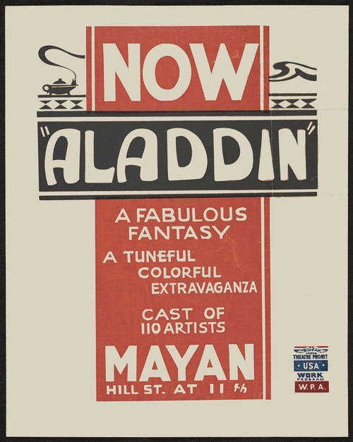
As we consider "Go get the Kaiser" from 1917, it's essential to situate this work within the cultural zeitgeist of its creation. Emerging amidst the fervor of World War I, this piece embodies the patriotic fervor and nationalist sentiment prevalent in early twentieth-century art. The artist's decision to employ a bold, graphic palette – reds, whites, blues, and oranges – serves as a visual manifestation of the era's heightened emotions and ideological commitments. Characterized by its stark, flat forms and Art Deco design sensibilities, this work exemplifies the modernist penchant for abstraction and simplification.
When enlarged to 44x55, "Go get the Kaiser" assumes a commanding presence within any interior environment. The chromatic structure, initially a vibrant interplay of colors, begins to unfold its spatial rhythm upon enlargement, with warm tones in the foreground subtly gradating into cooler hues toward the periphery. In this scale, the compositional structure becomes almost architectural in nature – a series of stepped forms and geometric shapes that seem to recede into the background like a majestic monument. The material pairing it suggests would be most effectively realized through juxtapositions of rich textures: polished woods against smooth leathers or cool marbles against rough-hewn wools, with lighting behaving as an atmospheric weight that shifts between luminous highlights on the brightest colors and deep shadows in the recesses of darker tones. As such, "Go get the Kaiser" would prove a formidable addition to any luxury interior, commanding attention through its sheer scale and visual presence while quietly influencing the surrounding space's material and spatial dynamics.
This edition adapts fluidly across contemporary interior profiles, offering a stable architectural anchor.
Architectural Behavior
Its vertical rise introduces a stabilizing architectural counterpoint.
This edition functions as a 44x55 interior anchor, shaping spatial rhythm and establishing a stable visual cadence within the surrounding architecture.
Its chromatic structure responds to natural and artificial lighting, modulating depth and atmospheric weight throughout the day.
Recommended material pairings include natural oak, brushed metal, matte stone composites, and textured linen surfaces.
Gallery Edition Specifications
- Format: 44" x 55" Interior Architectural Study
- Medium: 330gsm Ultra-Premium Fine Art Matte
- Ink System: Wide-gamut archival pigment curation
- Mounting: Delivered unframed for professional gallery installation
Each edition is prepared to order. Gallery-standard quality control requires 3 to 5 business days.