Curatorial Narrative
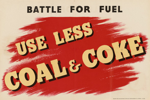
The anonymous creation "Help to Win the Battle for Fuel" embodies the quintessential spirit of propaganda art, yet its historical position is less about ideological fervor than about calculated persuasion. Executed in soft brushwork, the palette's stark red, white, and black dichotomy evokes a sense of industrial modernity, underscoring the subject matter's architectural focus on urban planning and infrastructure. This deliberate choice of design styles – industrial and modern – serves to reinforce the artwork's propagandistic intent, its chromatic structure imbuing the viewer with a sense of urgency and purpose.
Upon enlargement to 66x44 inches, the palette's atmospheric weight shifts dramatically, dominating the luxury interior environment with its bold presence. The spatial rhythm established by the composition's clean lines and geometric forms creates a sense of dynamism, while the stark contrast between red and white draws attention to specific design elements within the space. In this context, material pairing becomes crucial; juxtaposing sleek, high-gloss surfaces with rich, textured finishes can create an effective dialogue between old and new, as seen in the artwork's own juxtaposition of industrial grit and modernist ideals. Lighting behavior is also significantly influenced by the palette's chromatic structure: a well-placed LED strip or sconce can draw out the red's deep, almost velvety undertones, while a floor lamp can create an intriguing interplay between light and shadow on the white expanses. Ultimately, "Help to Win the Battle for Fuel" challenges interior designers to consider not only the artwork as a designed object but also its potential to recalibrate the spatial impact of their designs, injecting a sense of purpose and urgency into even the most luxurious environments.
This edition's spatial clarity and controlled palette align naturally with modernist interiors.
Architectural Behavior
Its horizontal span reinforces axial movement across long architectural planes.
This edition functions as a 66x44 interior anchor, shaping spatial rhythm and establishing a stable visual cadence within the surrounding architecture.
Its chromatic structure responds to natural and artificial lighting, modulating depth and atmospheric weight throughout the day.
Recommended material pairings include natural oak, brushed metal, matte stone composites, and textured linen surfaces.
Gallery Edition Specifications
- Format: 66" x 44" Interior Architectural Study
- Medium: 330gsm Ultra-Premium Fine Art Matte
- Ink System: Wide-gamut archival pigment curation
- Mounting: Delivered unframed for professional gallery installation
Each edition is prepared to order. Gallery-standard quality control requires 3 to 5 business days.