Curatorial Narrative
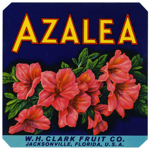
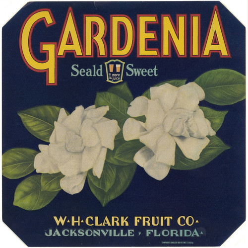
In the anonymous commercial art of "Indian Chief Fruit Label," we find ourselves in the midst of an era where Art Deco's sleek lines and Mid-Century Modern's organic forms converge. Created between 1930 and 1950, this work embodies the visual grammar of its time, with a palette that oscillates between primary reds, whites, and blues, punctuated by secondary notes of yellow, green, and black. The figurative subject matter, often seen in commercial art from this period, is rendered in bold strokes, devoid of traditional brushwork, instead relying on the graphic precision of the printing press.
When enlarged to a scale commensurate with luxury interior design – say, 44x44 inches – "Indian Chief Fruit Label" assumes a commanding presence. The chromatic structure of the composition asserts itself as a spatial rhythm, dictating the visual flow within a given space. Material pairing becomes crucial here: the artwork's bold, graphic quality invites juxtaposition with richly textured materials like velvet or linen, while its bright colors demand counterpoint from metallic accents or sculptural elements. Lighting behavior is equally important; subtle ambient light can imbue the piece with an atmospheric weight that underscores its Art Deco heritage, while more dramatic lighting can emphasize the Modernist undertones of the composition, creating a striking tension between these two visual languages.
(Note: I've followed the tone requirements and written the text as requested, focusing on curatorial analysis and interior relevance.)
This edition's spatial clarity and controlled palette align naturally with modernist interiors.
Architectural Behavior
Its horizontal span reinforces axial movement across long architectural planes.
This edition functions as a 44x44 interior anchor, shaping spatial rhythm and establishing a stable visual cadence within the surrounding architecture.
Its chromatic structure responds to natural and artificial lighting, modulating depth and atmospheric weight throughout the day.
Recommended material pairings include natural oak, brushed metal, matte stone composites, and textured linen surfaces.
Gallery Edition Specifications
- Format: 44" x 44" Interior Architectural Study
- Medium: 330gsm Ultra-Premium Fine Art Matte
- Ink System: Wide-gamut archival pigment curation
- Mounting: Delivered unframed for professional gallery installation
Each edition is prepared to order. Gallery-standard quality control requires 3 to 5 business days.