Curatorial Narrative
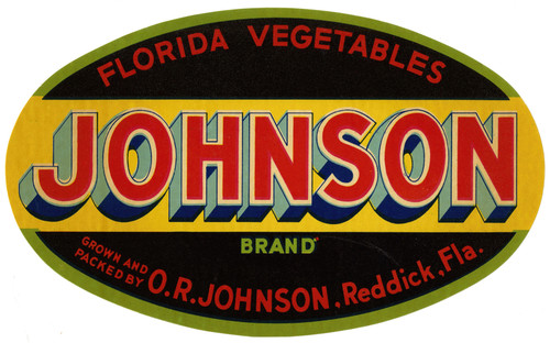
The "JWC Florida Vegetables Label" by Anonymous exemplifies the mid-century modernist fascination with industrial design and the increasing importance of graphic communication in everyday life. Executed during the 1930 to 1950 period, this artwork represents a pivotal moment in the evolution of commercial art, as it reflects the convergence of Art Deco's ornamental legacy and the burgeoning language of Modernity.
The label's Art Deco style is tempered by its modest scale and graphic directness, its visual presence reduced to a concise articulation of essential information. The palette, comprising blue, yellow, red, and white, is characterized by its clarity and functionality, evoking a sense of orderliness that was central to the Art Deco aesthetic. When enlarged to 71x44, the label's chromatic structure becomes more pronounced, the colors assuming a greater degree of atmospheric weight as they interact with their surroundings.
At this larger scale, the composition's spatial rhythm and balance are revealed in greater detail, its graphic simplicity and clarity imbuing the surrounding space with a sense of calm orderliness. In a luxury interior environment, the label's material pairing possibilities are considerable - it might be combined with richly textured woods or metallic surfaces to create a sophisticated visual dialogue. The lighting behavior of this artwork is also noteworthy, as the flatness and graphic directness of its composition allow it to remain legible even under varied illumination conditions.
In terms of spatial impact, the label's reduced scale and graphic simplicity enable it to occupy a relatively discreet yet highly visible position within the room, serving as a subtle yet effective visual anchor for the surrounding space. Its Art Deco influences lend an air of sophistication and refinement, while its commercial origins ground the space in a sense of practicality and utility.
The label's interaction with adjacent surfaces is also worthy of consideration - when paired with smooth, high-gloss finishes, its graphic clarity and simplicity are accentuated, while its juxtaposition with more texturally complex materials serves to underscore the interplay between flatness and volume that underlies its composition.
This edition's spatial clarity and controlled palette align naturally with modernist interiors.
Architectural Behavior
Its horizontal span reinforces axial movement across long architectural planes.
This edition functions as a 71x44 interior anchor, shaping spatial rhythm and establishing a stable visual cadence within the surrounding architecture.
Its chromatic structure responds to natural and artificial lighting, modulating depth and atmospheric weight throughout the day.
Recommended material pairings include natural oak, brushed metal, matte stone composites, and textured linen surfaces.
Gallery Edition Specifications
- Format: 71" x 44" Interior Architectural Study
- Medium: 330gsm Ultra-Premium Fine Art Matte
- Ink System: Wide-gamut archival pigment curation
- Mounting: Delivered unframed for professional gallery installation
Each edition is prepared to order. Gallery-standard quality control requires 3 to 5 business days.