Curatorial Narrative
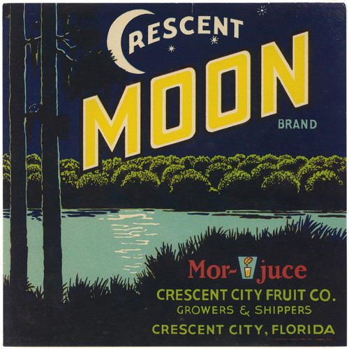
In the mid-1930s, the anonymous artist's "Crescent Moon Brand Fruit Label" exemplifies the burgeoning Modern aesthetic, characterized by a distinct departure from representational figural art. The label's visual language is replete with the hallmarks of Mid-Century Modern design: a deliberate use of primary colors, applied in flat, two-dimensional fields to convey a sense of graphic simplicity and modernity.
The palette, dominated by dark blues and greens, serves as a foil to the vibrant, if understated, yellow and red accents. These chromatic relationships establish an intriguing visual tension, one that invites the viewer's attention to oscillate between areas of relative calm and areas of heightened energy. When enlarged to 44x44 inches, this dynamic becomes even more pronounced, its spatial depth imbuing the surrounding environment with a sense of atmospheric weight.
When scaled up to architectural dimensions, "Crescent Moon Brand Fruit Label" behaves as a designed object in dialogue with material, light, and space. In a luxury interior setting, the dark blue fields can be seen as a backdrop for the strategic placement of lighter-colored accents – such as creamy whites or rich woods – which in turn serve to highlight the graphic simplicity of the label's design. The spatial rhythm thus established by the composition's bold geometric shapes creates a sense of dynamic equilibrium, one that is further reinforced by the judicious use of overhead lighting.
The Mid-Century Modern sensibilities informing this artwork lend themselves particularly well to pairing with rich, dark-stained woods and smooth, high-gloss surfaces. The label's graphic simplicity also makes it an ideal candidate for juxtaposition with more ornate or patterned elements – such as intricate textiles or sculptural accents – whose visual complexity is in turn tempered by the label's calm, graphic presence.
In this elevated interior context, "Crescent Moon Brand Fruit Label" functions not merely as a decorative element but as a carefully calibrated component of the overall spatial structure. Its atmospheric weight and chromatic structure serve to modulate the surrounding environment, imbuing the space with a sense of contained energy that is at once modern, sophisticated, and understated.
This edition's spatial clarity and controlled palette align naturally with modernist interiors.
Architectural Behavior
Its vertical rise introduces a stabilizing architectural counterpoint.
This edition functions as a 44x44 interior anchor, shaping spatial rhythm and establishing a stable visual cadence within the surrounding architecture.
Its chromatic structure responds to natural and artificial lighting, modulating depth and atmospheric weight throughout the day.
Recommended material pairings include natural oak, brushed metal, matte stone composites, and textured linen surfaces.
Gallery Edition Specifications
- Format: 44" x 44" Interior Architectural Study
- Medium: 330gsm Ultra-Premium Fine Art Matte
- Ink System: Wide-gamut archival pigment curation
- Mounting: Delivered unframed for professional gallery installation
Each edition is prepared to order. Gallery-standard quality control requires 3 to 5 business days.