Curatorial Narrative
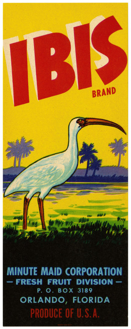
"Ibis Brand Fruit Label" by Anonymous occupies a liminal space within the modernist canon, its creation dating back to the tumultuous era of 1930-1950. Without the guiding hand of signature style or identifiable technique, this anonymous work presents itself as a blank slate, challenging our assumptions about the very nature of art production during this period. The artist's decision to eschew brushwork in favor of a more graphic, industrial aesthetic underscores the influence of machine-made imagery and the rise of mass production.
As we scale "Ibis Brand Fruit Label" to 44x44 inches, its deep blue hue becomes a forceful presence, dominating the spatial rhythm of a luxury interior environment. The stark white lettering and red accents slice through the chromatic structure like a scythe, disrupting any sense of atmospheric weight that might otherwise accumulate within the space. When paired with dark woods or rich leathers, the cool tone of the blue can create an unexpected tension, drawing the viewer's eye towards the bold graphic elements that dance across its surface. The green and yellow accents, meanwhile, inject a subtle vibrancy into the mix, subtly shifting the spatial impact to one of dynamic equilibrium rather than stasis.
The industrial design style of "Ibis Brand Fruit Label" imparts an unsettling stillness upon any environment in which it is displayed, as if the very presence of its graphic elements has arrested the flow of time itself. It is a quality that resonates particularly with luxury interior designers, who seek to imbue their spaces with an aura of controlled chaos – a state where elegance and precision reign supreme, even amidst the frenetic pace of modern life.
When viewed from afar, "Ibis Brand Fruit Label" recedes into the background, its spatial depth diminishing in favor of a more graphic, two-dimensional presence. Yet upon closer inspection, the intricate interplay between its various design elements reveals itself, each hue and line imbuing the space with a newfound sense of tension and release.
In its bold use of color and spare, modernist aesthetic, "Ibis Brand Fruit Label" recalls the era's fascination with the machine-made image – an interest that would go on to influence generations of designers and artists. When integrated into a luxury interior environment, this work serves as a poignant reminder of our collective reliance upon the anonymous, mass-produced objects that populate our daily lives.
The atmospheric weight of "Ibis Brand Fruit Label" is inescapable, its presence imposing a graphic discipline upon any space in which it is displayed. In this sense, it functions as a counterpoint to more traditional fine art forms, one that subverts expectations and challenges the viewer's perception of what constitutes art itself.
In a luxury interior environment, "Ibis Brand Fruit Label" would pair ideally with materials such as dark wood paneling or richly textured leathers, its bold graphic elements slicing through the spatial rhythm like a razor. The result is an unexpected union – one that highlights the often-overlooked role of industrial design in shaping our aesthetic experience.
The anonymous creator of "Ibis Brand Fruit Label" leaves us with a work that is at once both elegantly spare and deeply unsettling, its graphic elements imposing a sense of controlled chaos upon any space in which it is displayed. In this, we find a rare and precious thing: an object that resists easy interpretation, instead forcing us to confront the very nature of art itself.
By situating "Ibis Brand Fruit Label" at the nexus of industrial design and fine art, its anonymous creator offers us a fascinating case study in the blurred boundaries between these two ostensibly distinct fields. As we navigate the complex interplay between color, form, and space, we find ourselves lost in
This edition's spatial clarity and controlled palette align naturally with modernist interiors.
Architectural Behavior
Its vertical rise introduces a stabilizing architectural counterpoint.
This edition functions as a 44x44 interior anchor, shaping spatial rhythm and establishing a stable visual cadence within the surrounding architecture.
Its chromatic structure responds to natural and artificial lighting, modulating depth and atmospheric weight throughout the day.
Recommended material pairings include natural oak, brushed metal, matte stone composites, and textured linen surfaces.
Gallery Edition Specifications
- Format: 44" x 44" Interior Architectural Study
- Medium: 330gsm Ultra-Premium Fine Art Matte
- Ink System: Wide-gamut archival pigment curation
- Mounting: Delivered unframed for professional gallery installation
Each edition is prepared to order. Gallery-standard quality control requires 3 to 5 business days.